Air quality continues to be in the news with New York Times articles like these:
- Health Risks of Smoke and Ozone Rise in the West as Wildfire Worsen
- Even Low Levels of Soot Can Be Deadly to Older People, Research Finds
A quick review of web based air quality resources shows a range of sites featuring maps, time series plots and relevant information.
At 11:22 on Friday, January 28, 2022, the town of Lancaster, PA is having a period of poor air quality. Presumably, this is because of a mild inversion though the NWS Area Forecast Discussion doesn’t mention anything specific:
.SYNOPSIS...
Light snow will continue across most of central PA this
afternoon into the evening. Snow will taper from north to south
early tonight and pivot across the lower Susquehanna Valley
before exiting Saturday morning. A blustery north wind on the
west-side of the Nor`easter will direct arctic air back into
the area with very cold temperatures and frigid wind chills
tonight into Sunday morning. A pattern change will bring a
noticeably warming trend to start the month of February, with a
strong precipitation signal around the middle of next week.
Lets review some of my favorite sites for air quality information to see how people might learn about air quality in the Lancaster, PA region.
AirNow
The AirNow site is the official EPA site for air quality information. One can type in “Lancaster, PA” and quickly arrive at the following page for Lancaster, PA. This page provides a quick read of current conditions, a map and basic text on general actions to take. Numeric values are in terms of the EPA Air Quality Index or AQI.
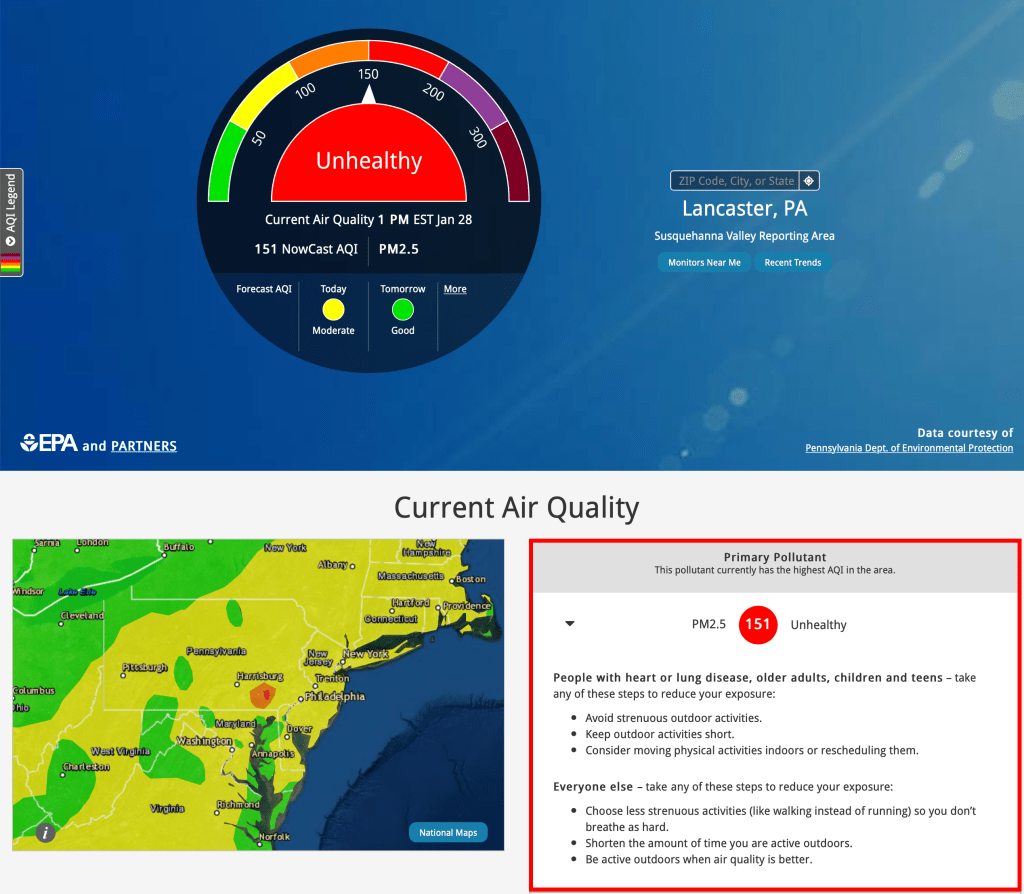
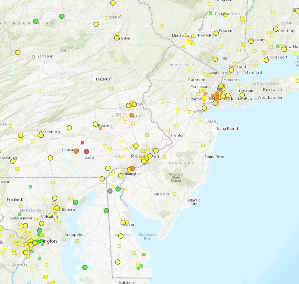
From this page you can click on “monitors Near Me” button to arrive at the AirNow interactive map. This map is for experienced users and you must adjust the layers to see the AQI associated with PM2.5 only:

AirNow Fire and Smoke map
AirNow also hosts a Fire and Smoke Map which brings together several sources of data including circles for regulatory monitors as well as small squares for low-cost sensors installed at individual households. The map looks similar to the map above with the removal of non-reporting monitors and a generous sprinkling of AQI values reported by sensors. The sensor data goes through an EPA-approved QC, aggregation and conversion algorithm to remove suspect values before it is displayed.
PurpleAir
For comparison, the PurpleAir map shows data from low cost sensors sold by PurpleAir. The default PurpleAir map differs from the AirNow Fire and Smoke map above in the following ways:
- uses 10-minute rather than hourly averages
- doesn’t use the EPA conversion algorithm
- includes indoor measurements
- uses a smooth palette rather than binned colors

Although all of these choices can be modified by a savvy user, the default settings give a very different sense of air quality at first glance. The map below shows the same data displayed as small squares in the map above.

USFS AirFire Monitoring v4
The USFS AirFire group maintains a public PM2.5 Monitoring v4 site for use primarily by ARAs (Air Resource Advisors) during wildfires. This web site displays PM2.5 data measured in instrument native micrograms per cubic meter rather than AQI and provides a variety of output graphics to help ARAs advise the public on smoke conditions and make forecasts.

AQICN
The AQICN site is based in China and does a remarkably good job of bringing together a variety of air quality and weather information and presenting it visually. At their site, users can browse a map or type in a location name. Clicking on their “Lancaster Downwind” site, one arrives at the following page:

Review
For knowledgable people, the sites just mentioned provide a ton of information available about real-time air quality. But there is also opportunity for confusion based on differing units, differing color scales, differing conversion factors, etc.
Below, I identify a few pros and cons associated with each site. These are entirely my own opinion and reflect my own sensibilities and tastes.
AirNow location page
- Pros
- EPA official page
- Uses AQI scale
- Current conditions are front and center
- Smoothed map is less cluttered than other maps
- Includes text for recommended actions
- “Recent Trends” button accesses time series graphs
- Cons
- Current conditions dial is unnecessarily complex
- Lack of quick summary graphics to use elsewhere
AirNow interactive map
- Pros
- Simple UI
- Uses AQI scale
- Features for advanced users
- Cons
- Defaults to AQI from either Ozone or PM2.5
- Time series plots only cover 1 day
- Lack of quick summary graphics to use elsewhere
PurpleAir map
- Pros
- Lots of sensor data
- Raw data plots allow assessment of sensor state-of-health
- Features for advanced users
- Cons
- Default settings differ from other sites
- Continuous color palette make air quality appear worse than a binned palette
- Not enough QC to hide sensors that are misbehaving
- Lack of quick summary graphics to use elsewhere
AirNow Fire and Smoke map
- Pros
- Uses AQI scale
- Includes low-cost senors
- QC removes unreliable sensor data
- Per-site information available with a single click
- Time series plots cover 10 days
- Features for advanced users
- Cons
- Lack of quick summary graphics to use elsewhere
USFS AirFire Monitoring v4
- Pros
- Map, time series and charts in a single interface
- Includes multi-day time series plots
- Static images can be used in email, reports, etc.
- Time-of-day plots provide actionable information
- Features for advanced users
- Cons
- Uses units of micrograms/m3
AQICN
- Pros
- Includes sites around the world
- Includes weather variables
- Includes 2-day time series
- Includes detailed forecasts
- Includes a link to include a graphic in social media
- Features for advanced users
- Cons
- Map is a little cluttered
- High information density might be overwhelming to casual users
Overall Assessment
We should consider ourselves fortunate to have multiple excellent web sites to check for air quality information. All of the sites above provide useful information to a particular target audience. Weather junkies might head to AQICN for the presentation of atmospheric variables while smoke specialists may prefer the Monitoring v4 site. During wildfire season, the AirNow Fire and Smoke map provides the best compilation of relevant data. People who want a regional overview may like the AirNow current and forecast maps while individuals worried about air quality in a small town may head straight to the PurpleAir map.
Hopefully, this short review will encourage everyone working on air quality dashboards and infographics to learn from the excellent examples that already exist.

Useful information, thanks for sharing..!
LikeLike