Graphical excellence is that which gives to the viewer the greatest number of ideas in the shortest time with the least ink in the smallest space.
Edward Tufte, The Visual Display of Quantitative Information
This post briefly summarizes our thoughts on best practices for designing public-facing data graphics for air quality data. Focus will be on the types of charts we feel are appropriate to use with data (e.g. from low-cost sensors) that may not be as accurate as data collected by monitors using Federal Regulatory or Federal Equivalent Methods (see FRMs/FEMs and Sensors). Visualization types discussed will include:
- maps
- time-series charts
- calendars
- status and forecast tables
Over the last few years, increasing attention has been paid to air quality (AQ) and its associated health effects. In the western United States, recent large wildfires have caused extended bouts of unhealthy air in densely populated urban areas and have raised both public awareness and public health concerns. Even in non-wildfire conditions, public health and environmental justice advocates have called attention to the relative paucity of professionally maintained AQ monitors visible at sites like AirNow. California Assembly Bill 617 (our summary here) attempts to address this with a program of community based monitoring, often using low-cost sensors.
FRM/FEM monitors vs. low-cost sensors
Years of effort have gone into ensuring that FRM/FEM monitors provide the most accurate measurements possible for their target pollutants including particulate matter (PM2.5), Ozone, Carbon Monoxide (CO) and other criteria air pollutants. One major concern among air quality professionals is how best to work with data from sensors that may not be properly sited and are typically not maintained. This data will never be of the same quality as data from FRM monitors.
Despite these concerns, there is great interest in working with sensor data because of the high spatial and temporal resolution of this data. Lesser quality data is better than no data at all, especially if measurements are corroborated by other nearby sensors. A screenshot from the AirNow Fire & Smoke map shows the coverage of PM2.5 sensors (small squares) and FRM/FEM monitors (circles) in south San Francisco Bay.

Important concepts
Before we begin, it is important to focus on a few concepts we feel are fundamental to data visualization. Below, we describe the meaning behind several specific phrases we often use when describing data graphics.
- Tell a story. — Scientists, engineers and analysts are often enamored of raw data and complex data graphics in and of themselves. To engage a wider audience it is important to add some human context to each data graphic — to “tell a story” about what this data means to a non-expert.
- actionable information — One of the best ways to tell a compelling story is to provide information that anyone might find useful. An example might be a plot showing pollution levels by hour of day which might communicate whether people should walk their dog in the morning or in the afternoon.
- exploratory — Experts like “exploratory” data visualization systems with lots of controls that allow them to thoroughly interrogate a dataset. They may not mind the occasional “garbage in/garbage out” graphic and can be expected to understand and correct for bad input values.
- explanatory — Non-experts are better served by “explanatory” systems with graphics that tell a story. They should be presented with limited, validated input options to ensure that errors are infrequent and that all output graphics “make sense”.
- interactive — Modern browsers and javascript libraries enable the creation of highly interactive data visualizations that can be very engaging and invite the individual user to customize data graphics and to further explore the data. Software development is typically required for interfaces with interactive graphics.
- static — Static graphics (pre-generated images) neither require nor allow user interaction and are often a good choice for explanatory visualizations. Static graphics are useful because they can be easily included in reports, blog posts and social media feeds.
- visual clutter — Our goal in presenting data graphics is to allow people to “see the data” and have an “Aha!” moment, drawing their own conclusions. Annotations like axes, tic marks, labels, legends, etc. end up distracting from the actual display of data and should be kept to the minimum level required to properly interpret a graphic.
Maps
Ideally, air quality maps should allow people to identify air quality in their own neighborhood. This implies a high density of monitors and sensors as in the Fire & Smoke map above or a model-driven interpolation as in the map below from the South Coast Air Quality Management District (SCAQMD).

Colors
- AQI color scale where reasonable — The EPA has worked hard over multiple decades to get state and federal agencies to adopt the Air Quality Index (AQI) and associated color scale: green = GOOD, yellow = MODERATE, orange = USG, red = UNHEALTHY, purple = VERY UNHEALTHY, maroon = HAZARDOUS. This color scale has been adopted internationally and is used by low-cost sensor providers like PurpleAir. Because it is widely understood, the AQI color scale should be used whenever measured data can be converted to AQI categories with some confidence.
- Adjust AQI colors as needed — The AQI color scale has a couple of downsides: 1) the recommended green (GOOD) and orange (Unhealthy for Sensitive Groups or USG) are almost indistinguishable to the 5% of males who are red-green color blind; and 2) the appearance of colors changes when rendered with partial opacity over a green tinted base map as in the maps above. Unlike the height of a bar, a color is perceived differently in different situations and AQI colors should be adjusted slightly to make graphics interpretable and attractive.
- AQI color ramp option — The AQI color scale has discreet levels and only six colors. Some sites like the PurpleAir interactive map choose to use a continuous color scale rather than discreet levels. This adds a level of nuance that we feel is appropriate. There is a continual increase in health impacts as pollution increases rather than a jump when moving from one AQI level to the next so a continuous color scale makes sense.
- Non-AQI color scale when necessary — When working with data where conversion to AQI categories is questionable, a non-AQI color scale may be needed to convey that pollution levels may not be equivalent to the EPA AQI levels. In these cases, a single-color palette should be used with light representing low and dark representing high levels of pollution.
Units
For qualitative presentation of data, we discourage the display of numeric values in maps. People can get overly fixated on individual numbers which may have low accuracy or low precision or both. Viewing a map colored by AQI conveys the important, potentially actionable information even without numbers.
Still, many interactive maps do display measurements associated with individual sensors or monitors. Here, one has to make a choice among several possible units: AQI, NowCast and measured units.
- AQI where reasonable — Just as with colors, the AQI value should be displayed as often as is reasonable because it is well known.
- Measured units when necessary — If there is little confidence in the conversion of measured units to AQI, measured units should be displayed. For the owners of many low-cost sensors these numbers will match what they see coming out of their sensor.
- NowCast for experts — NowCast is a smoothing algorithm developed by the EPA and is used in the conversion of measured values to AQI. Explaining this adds unneeded complexity for non-experts and NowCast should not be included in qualitative displays.
The PurpleAir interactive map defaults to showing AQI values but has controls that allow users to choose among several data conversions. AQI values are shown in the screenshot below. The PurpleAir map interface has enough controls to make experts happy. However, we believe it presents a potentially confusing number of options to non-professionals.

Displaying uncertainty
Maps displaying grids of interpolated values (e.g. the SCAQMD map) often mask variability in the underlying sensor and monitor data. This is good when it masks bad data coming from malfunctioning sensors. But it can also be bad, especially in hilly terrain, when it masks real spatial variability in air quality.
For a target audience of people making decisions at a regional level, e.g. health professionals, subtle spatial variation may be unimportant.
But for individuals this spatial variation can be very useful, especially if it means that a short drive can result in temporarily improved air conditions. Real-time displays of data showing values at individual sensors, as seen in the PurpleAir map above, can provide useful, actionable information to individuals.
Time-series charts
Understanding the temporal evolution of air quality data helps people interpret their own experience, can provide actionable insight into daily patterns and can help community members identify improving or worsening trends in local air quality. Both FRM/FEM monitors and low-cost sensors collect air quality data as time series at specific locations. (For this discussion we will ignore mobile monitors.) The basic presentation will always have time on the x-axis and pollutant level on the y-axis. Within this familiar graphical format, some basic rules should rarely, if ever, be violated:
- y-axis — The y-axis should always begin at zero.
- y-scale — Ideally, plots covering similar periods of time should be comparable by visual inspection without reading often tiny axis tic labels. This means that the y-axis scale should not change very often. Instead of choosing a scale to exactly fit the data, one of a few pre-defined scales should be chosen based on the data. With this approach, most plots of data from sensors within a single community will use the same y-scale and be directly comparable visually.
- title — Every plot should have a title describing what is being shown.
Annotations
For the qualitative display of information to community members it is not necessary that graphics always have a “publication ready” level of annotations. Simple graphs with less visual clutter can communicate more effectively once people learn how to interpret them. If AQI colors are being used to convey air quality levels, units can be left off of the y-axis. The meaning of AQI colors is well understood and a legend explaining them need not appear on every graphic.
More detailed annotations and a legend are appropriate for static, explanatory graphics intended for sharing. These graphics should have enough annotations that they can be understood on their own. For many visualizations, legends can be avoided entirely as long as the legend information is easily available elsewhere.
Points, lines and bars
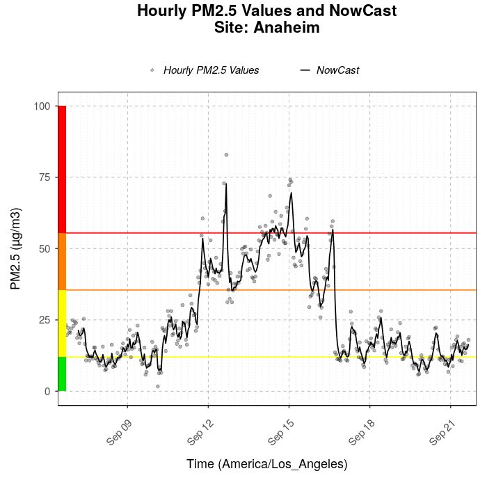
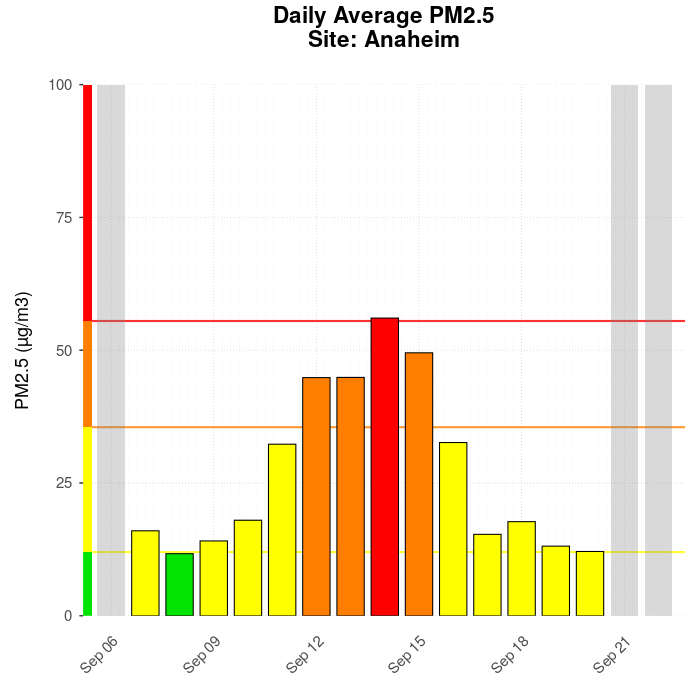
We generally prefer points for high resolution, unsmoothed data. Just a few outliers can cause lines and bars to fill up a plot with visual clutter that does not represent actual data values. Lines are best used to identify data that has been smoothed. Bars are appropriate when data are aggregated to daily or monthly averages. The plots below demonstrate these principles and come from the USFS Monitoring v4 site:
Colors and units
As discussed in the section on maps, AQI colors and units are preferred when presenting qualitative graphics to local communities. These colors and units are likely to match other information they may encounter. (Note that the two graphs above use AQI colors with units of μg/m3 because the target audience is primarily USFS Air Resource Advisors who are more accustomed to the measurement units coming out of a monitor. If no units were displayed at all, the meaning of the graphs would not change.)
As seen above, AQI categories can be shown as a stacked color bar along the side of a plot or as colored bars for daily averages. We are not fans of coloring the background with AQI colors unless the colors are very subdued. We want to draw peoples eyes to the data, not the background.
Displaying uncertainty
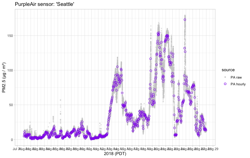
In a time-series context, measurement uncertainty in data from low-cost sensors is best displayed by simply showing every raw data point along with QC’ed, hourly averages. The spread of values around the average gives people a sense of the “error bars” around any given data point. The example below was generated with the AirSensor R package:
When a community has many low-cost sensors in close proximity, a plot of raw data from all sensors will give people a very good sense of inter-sensor variability. Displaying each point with partial opacity will give viewers a very intuitive sense of main trends and outlier values. The following example is taken from a presentation on the AirSensor R package. Although the plot, as labeled, seems to have more questions than answers, it is explanatory if the concept being explained is the variability of sensor data within a community. This example also displays the use of day-night shading to make any diurnal patterns more apparent.

Time-of-day charts
One of the more useful charts for communities experiencing poor air quality is the time-of-day graphic which shows recent air quality as a function of the hour of the day. Pollution levels often have a strong diurnal signal and knowing what part of the day will have the best or worst air quality is the perfect example of actionable information. The two examples below come form the USFS Monitoring v4 site and from personal communication with Kris Ray.
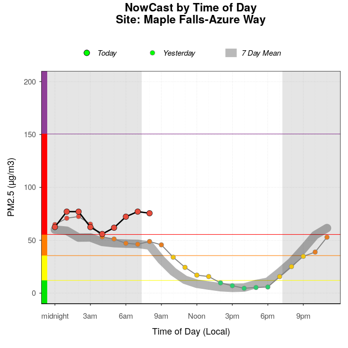

The first plot comes from a real-time system. It displays a 7-day average and highlights “Yesterday” and “Today” and is immediately useful — Walk the dog in the afternoon! The second plot shows the diurnal cycle during winter months using historical data but a similar presentation could also be used for real-time data. In both plots, the use of colors means that numbers on the y-axis could be left off for a more qualitative presentation.
In the upper graph, several subtle touches are included to make this graphic more useful to real-time viewers:
- The presence of day-night shading highlights recent diurnal cycles that may match with lived experience — It was smoky when I woke up.
- Commonly understood time labels make it more accessible to non-experts.
- The inclusion of Yesterday in small circles and Today in larger circles highlights the most recent data and gives people a sense of the day-to-day trend.
Calendars
Calendar “heat maps” are among the more popular air quality displays for communities. A calendar is immediately recognizable and can clearly identify days of poor air quality. Communities may associate these days of poor air quality with contemporaneous events in an effort to identify sources of air pollution. The following calendar display for Marysville, Washington is immediately interpretable by anyone familiar with AQI color categories:
- Late spring and summer had GOOD air quality (except for July 4 fireworks)
- September 8-18 had unusually poor air quality (because of a wildfire)
- Cold-weather months have periods of MODERATE air quality (during atmospheric inversions)

Another type of calendar heat map is seen at the AQICN site. (AQICN provides an excellent interface for quickly reviewing air quality data from around the world.) They have an interesting, very compact calendar display which includes a summary “stacked bar” on the left displaying the number of days spent in each AQI category. Individual calendar cells display the AQI average value for that day. The calendar below is for the same site and same year as the calendar above — Marysville, Washington.
While this display presents a tremendous amount of information in a small space, we feel it is designed for a target audience of air quality and public health professionals working at the regional or national level. The lack of a familiar calendar format makes this display harder to interpret and less appropriate for community members trying to match air quality data to their lived experience.

Status and forecast graphics
Many public facing sites provide quick-look status and forecast graphics. The intention is to provide members of the public with a quick assessment of air quality in their area. Status and forecast graphics are the epitome of explanatory graphics and are most usefully presented as static images that can be shared on social media. These graphics are often displayed as tables and should ideally include the following elements:
- title — The title should include both the current date and a commonly recognized site name. Many monitors have IDs or names that may not make sense within a given community. Ideally, these would be replaced with a name familiar to community members.
- current status — Current air quality is typically displayed as a large AQI color block, sometimes with the AQI index or AQI category. Some sites use visual “dials” or “thermometers” but we feel that these increase visual clutter without improving the information content. The keep-it-simple principle would suggest that a large AQI color block is all that is needed to convey current air quality conditions.
- recent history — The best status graphics include a small display of recent hourly AQI values for a site. This gives viewers a sense of recent trends or diurnal patterns that will help them interpret forecasts.
- expert forecast — The second most important question to answer after “What is it like now?” is “What will it be like in the future?”. Forecasts for air quality later in the day or later in the week provide immediate actionable information and should be displayed as simply as possible — as small blocks of AQI color. Where human forecasters are involved, a small text summary can be very helpful.
AQICN widget
Our first example is a widget that AQICN makes available for inclusion on other web pages:
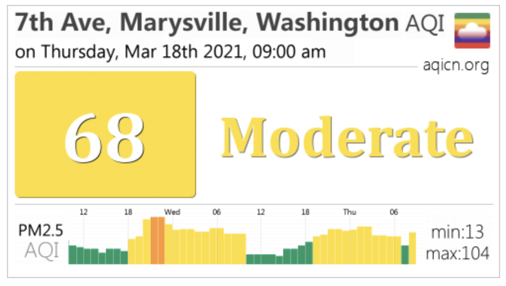
This simple widget provides everything someone might want at a glance:
- The title includes both location and time in common English.
- The current status is big and bold and includes AQI color, AQI category and AQI value.
- The small bar chart provides 48 hours of context and omits a y-axis in favor of min/max readings.
- This graphic can be seen and understood at greatly reduced size and is perfect for inclusion as part of a dashboard or in social media feeds.
Smoke Forecast Outlooks
During wildfire season, the US Forest Service (see IWFAQRP) puts out Smoke Forecast Outlooks in regions of intense wildfire activity. These forecasts include a status and forecast table that includes all sites impacted by a particular fire. The table below is from an outlook issued just as the Oregon wildfires of September, 2020 were beginning:

As in the AQICN widget, each row of the table includes a recognizable location name, a simplified bar chart with 24 hours of recent data, an AQI color dot for current conditions and two more AQI color dots for “tomorrow” and “the next day”. Because these outlooks are created with human input each day, a small text summary is provided to help members of the public interpret what the forecast means for them.
Take-home messages
This post has presented a number of plots that we like with commentary on which elements of each plot are appropriate for presentation of qualitative information to members of the public. We will finish up with a list of goals to strive for when creating qualitative graphics.
- Use AQI colors whenever possible. — The AQI color scale (even with minor adjustments) is very well known at this point. Because the colors and associated categories are so well known, graphics can be greatly simplified by omitting legends and y-axis tic labels.
- Use only a few, carefully crafted graphics. — Understanding a new type of data visualization takes time and attention. When creating explanatory graphics, we want our audience to spend their time understanding what the data means in terms of actionable information, not struggling to understand how to interpret the graphic.
- When desired, display raw data in the background in muted colors. — Displaying raw data can be important when one wants community members to understand how data from their personally-installed sensor is being used. Air quality data from low-cost sensors is invariably aggregated into hourly averages before being combined with weather or FRM/FEM monitoring data. Putting raw data in the background and aggregated data in the foreground can make it clear how low-cost sensor data is processed.
- Avoid unnecessary annotations. — As seen in the mini bar charts in the status and trends table above, data can still be understood with few-to-no axis labels, especially when presented in a table of “small multiples”. The level of annotation should always be adjusted depending on the target audience and the visual context in which a graphic is presented. Not every chart needs to be ready for publication in a scientific journal.
- Do include helpful visual elements. — The day-night shading in some of the plots shown adds real value without distracting from the data. Knowing when dawn and dusk are helps people understand diurnal patterns and helps them plan their activities around those variations.
